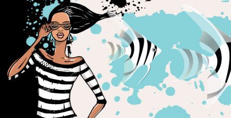
Five different RETRO color palettes inspired by the iconic colors of that time.
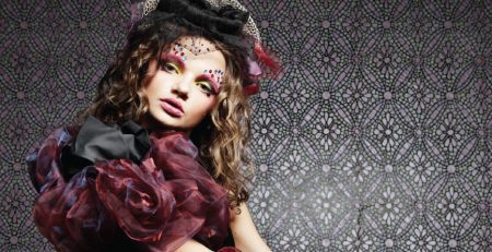
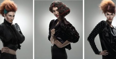
During the years between 1960 and 1970, fashion and design embraced a vibrant and diverse color palette that reflected the dynamic and transformative spirit of the era. Here are some color specifics that were commonly used and iconic during this period:
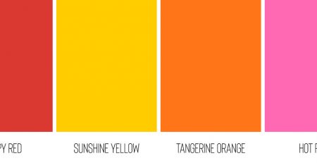
Poppy Red: A bold and attention-grabbing red that symbolized passion and energy.
Sunshine Yellow: A vibrant and optimistic yellow that represented joy and positivity.
Tangerine Orange: A warm and lively orange that evoked a sense of enthusiasm and creativity.
Chartreuse Green: A bright and fresh green with hints of yellow, adding a touch of vitality to designs.
Hot Pink: An intense and vivacious pink that conveyed femininity and individuality.
Turquoise Blue: A refreshing and soothing blue-green shade that brought a sense of tranquility.
Magenta: A striking and rich shade of purple pink that added drama and flair to fashion.
Lime Green: A zesty and playful green that added a touch of excitement and fun.
Electric Blue: A bold and electrifying blue that represented innovation and modernity.
Mellow Yellow: A soft and gentle yellow that exuded warmth and comfort.
Mustard Yellow: A warm and earthy yellow with a hint of brown, offering a touch of sophistication.
Sky Blue: A light and airy blue that conveyed a sense of serenity and optimism.
Cherry Red: A deep and passionate red that added a touch of glamour and allure.
Olive Green: A subdued and earthy green that brought a sense of natural elegance.
Chocolate Brown: A rich and warm brown that added depth and richness to designs.
Purple Haze: A dreamy and mysterious shade of purple that captured the era’s psychedelic spirit.
Burnt Orange: A deep and warm orange with brown undertones, evoking a sense of nostalgia.
Coral Pink: A soft and delicate pink with hints of orange, representing femininity and romance.
Goldenrod: A warm golden yellow that symbolized abundance and luxury.
Brick Red: A deep and earthy red that added a sense of warmth and coziness.
These colors reflected the cultural, social, and artistic movements of the time, including the mod and hippie subcultures, the Space Age, and the psychedelic revolution. The use of bold and vibrant colors in fashion and design during the 1960s and 1970s expressed a spirit of experimentation, freedom, and a rejection of traditional norms. These iconic colors continue to inspire and influence contemporary fashion and design with their timeless appeal and nostalgic charm.
Here are five different color palettes inspired by the iconic colors frequently used in the fashion industry during the years from 1960 to 1970, each with at least 7 different colors:
Groovy Tones
| Hot Pink | Orange | Yellow | Green | Blue | Purple | Brown |
| Electric and daring, Hot Pink adds flair and drama. | Orange embodies the energy and optimism of the era. | Yellow symbolizes the carefree spirit of the time. | Green represents nature and harmony. | Blue reflects a sense of escape and freedom. | Purple exudes creativity and individuality. | Brown complements with earthy warmth. |
| RGB: 255, 64, 129 | RGB: 255, 152, 0 | RGB: 255, 193, 7 | RGB: 76, 175, 80 | RGB: 3, 169, 244 | RGB: 156, 39, 176 | RGB: 121, 85, 72 |
Above color palette is inspired by the iconic colors that were frequently used in the fashion industry between the years 1960 and 1970. They capture the vibrant and expressive spirit of that era and can add a touch of retro charm to any design. Feel free to use these palettes as a starting point for your projects, and let your creativity flow!
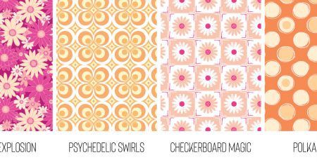
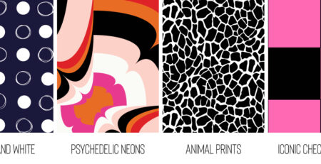
Here are 5 different, well-balanced, beautiful, and harmonious color palettes inspired by retro style:
Palette 1: Retro Pop
| Red Orange | Canary Yellow | Deep Blue | Mint Green | Pastel Peach | Bright Sky Blue | Yellow |
| A lively and energetic red-orange. | A vibrant and cheerful canary yellow. | A bold and deep shade of blue. | A refreshing and soothing mint green. | A soft and sweet pastel peach. | A bright and captivating sky blue. | A warm and sunny yellow. |
| RGB: 242, 95, 92 | RGB: 255, 224, 102 | RGB: 36, 123, 160 | RGB: 112, 193, 179 | RGB: 253, 203, 158 | RGB: 27, 152, 224 | RGB: 255, 209, 102 |
Palette 2: Retro Pastels
| Lemon Chiffon | Peachy Pink | Dusty Rose | Sage Green | Lavender Gray | Rose Quartz | Lilac |
| A soft and delicate lemony yellow. | A warm and gentle shade of peachy pink. | A vintage-inspired dusty rose. | A muted and earthy sage green. | A sophisticated and dreamy lavender gray. | A soft and elegant rose quartz. | A calming and romantic shade of lilac. |
| RGB: 249, 235, 178 | RGB: 242, 210, 178 | RGB: 217, 187, 178 | RGB: 178, 199, 169 | RGB: 178, 169, 199 | RGB: 231, 178, 199 | RGB: 214, 162, 225 |
Palette 3: Retro Earth
| Burnt Sienna | Terra Cotta | Golden Brown | Muted Mustard | Olive Gray | Slate Gray | Warm White |
| A warm and rich burnt sienna. | A deep and earthy terra cotta. | A rich golden brown that adds a touch of opulence. | A muted mustard shade that adds a touch of warmth. | A vintage-inspired olive gray that complements the palette. | A versatile and timeless slate gray for balance. | A warm white that brings a touch of softness. |
| RGB: 109, 59, 43 | RGB: 188, 108, 37 | RGB: 233, 176, 129 | RGB: 143, 138, 106 | RGB: 164, 180, 148 | RGB: 145, 157, 157 | RGB: 231, 230, 225 |
Palette 4: Retro Vintage
| Dusty Rose | Pale Pink | Peach | Vanilla Cream | Sage Green | Pale Green | Cornflower Blue |
| A vintage-inspired dusty rose. | A soft and delicate pale pink. | A warm and inviting peach. | A creamy and soothing vanilla cream. | A calming and earthy sage green. | A light and refreshing pale green. | A classic and vibrant cornflower blue. |
| RGB: 200, 107, 133 | RGB: 244, 169, 168 | RGB: 247, 201, 182 | RGB: 255, 237, 193 | RGB: 212, 230, 181 | RGB: 177, 204, 116 | RGB: 113, 166, 210 |
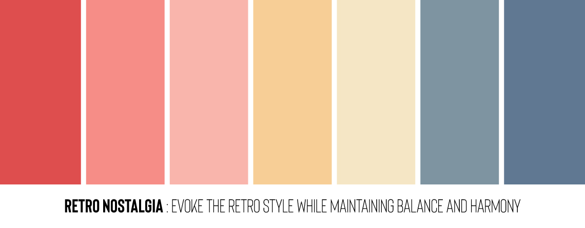
Palette 5: Retro Nostalgia
| Cherry Red | Coral Pink | Pale Pink | Apricot | Pale Yellow | Steel Blue | Slate Blue |
| A classic and bold cherry red. | A vibrant and cheerful coral pink. | A soft and delicate pale pink. | A warm and sunny apricot shade. | A pale yellow that adds a touch of brightness. | A cool and sophisticated steel blue. | A timeless and versatile slate blue. |
| RGB: 222, 77, 78 | RGB: 246, 141, 135 | RGB: 249, 181, 172 | RGB: 247, 206, 150 | RGB: 245, 230, 196 | RGB: 126, 148, 161 | RGB: 90, 104, 114 |
These color palettes are carefully curated to evoke the retro style while maintaining balance and harmony. They can be used in various design projects, from fashion to graphic design, to create a nostalgic and captivating atmosphere. Enjoy experimenting with these vibrant and captivating colors!